


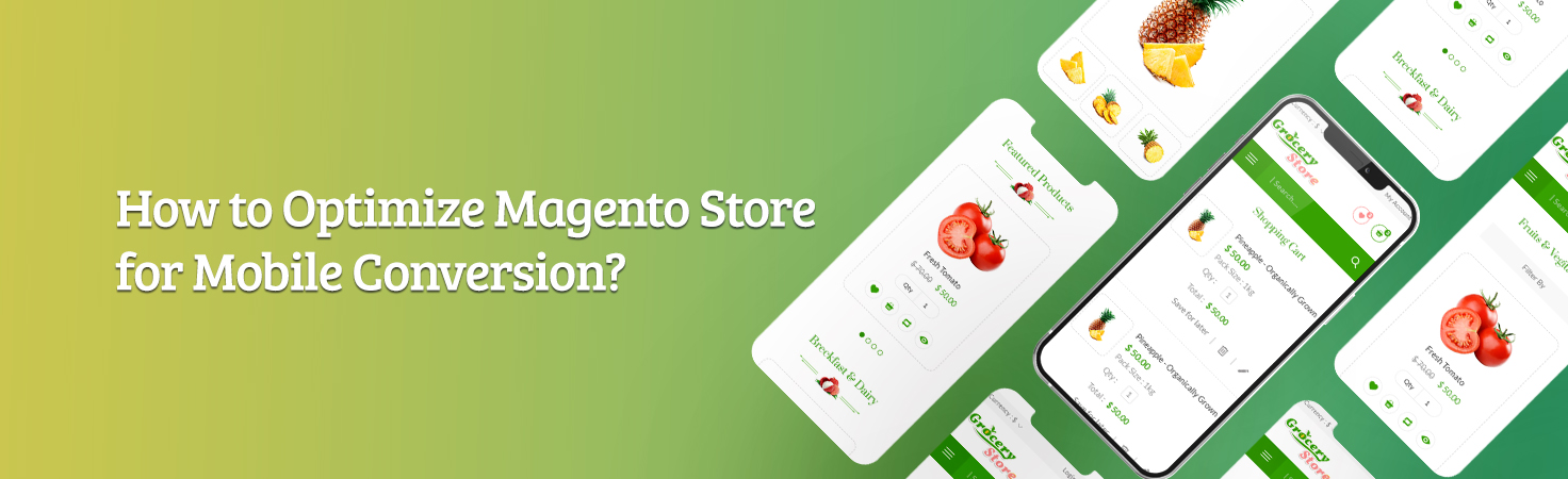
With the eCommerce stores experiencing an extraordinary surge in adoption, now is the time to catch up with the upcoming trends that customers prefer. Transitioning from a physical store to an eCommerce store was a great challenge, it is high time to make the management and development of your eCommerce store easier. If you have built the store with Magento 2, you've already made a great choice.
Magento helps increase your visibility and website ranking as it is the platform's fully-equipped features and is highly customizable and SEO-friendly. If you have been an eCommerce store owner for at least a year now, you might already know that the next phase for eCommerce is mobile commerce. Mobile eCommerce traffic has been seen increasing wildly and this has led to a high surge in mobile optimization and advancements of that as well.
Especially with Covid 19 pandemic, in 2020 itself, mobile commerce sales increased to 33.6% at $778 billion. This year, eMarketer projects further growth to reach $907 billion with an uptick of 13.7%.
The connection speed for the average mobile user has increased in the last 10 years in the US. There are various opportunities that come from this growth and a lot can be gained through a high-performing website. It is a must for any store to deliver a high-end customer experience on the basis of speed as mobile shoppers require fast responses.
Do you think your Magento 2 store can achieve this high-speed goal?
Even though the Magento 2 stores bring in rich capabilities, there are certain adjustments required to make your store mobile-friendly and turn your website into a mobile app.
How to Optimize Online Store on Magento 2 for Mobile?
#1. MAKE WEB DESIGN BEAUTIFUL



The research mentioned 'The world has 4.72 billion Internet users, and 92.8 percent of those use mobile devices to access the web.
Though desktops and laptops are important mediums, people also use various other platforms.
When a user visits your store from phone or tablet, there are various areas of design that don't display well or some products/elements of the design are difficult to click. This makes it difficult for them to smoothly operate on the store and makes them leave out of frustration. The best solution for this problem is a mobile-friendly design, it delivers a frictionless experience.
#2. MAKE IT EASY TO NAVIGATE
Users won’t spend time learning how to use your website. The moment they enter your site, it should be easy for them to know what to do and find what they need. Your e-commerce store shouldn’t only look beautiful, it should also offer a seamless journey for the user.
Recommended: Magento 2 Layered Navigation for Better Website Navigation & SEO
At the most basic level, your visitors should be able to find important elements, like the main menu, shopping cart, search bar, pages, blog, and links.
Sometimes, you may not have the space to include all the pages or tabs that can be viewed on the desktop version of your site, this is because navigational features are often limited in mobile design.
Make sure that the important pages of your website are easily accessible. This will push visitors to stay on your website longer.
#3. SPEED IT UP
A page should load in less than 3 seconds; less than two would be perfect. Every second counts for e-commerce sites because a moment’s delay will interrupt the buying process.
Recommended: Convert your Magento Store to Progressive Web Apps that Loads Quickly
Here are some things you can do to improve loading time:
• Optimize image size. Reduce heavy images and convert them to small files. You can use tools like TinyPNG that will let you resize images without the need to install an application.
• Remove unnecessary JavaScript or any elements that will take time to load.
• Minimize redirects.
#4. HAVE AN INTUITIVE CHECKOUT PROCESS

When a user lands on your e-commerce store, the goal is to move them toward the checkout cart and get them to buy your items. For this to be a success, you need to have a checkout process that’s optimized for mobile.
Recommended: Magento 2 One Step Checkout For Seamless Checkout & Best Shopping Experience
Unlike normal websites, e-commerce stores can process orders, and fulfill payments, among other things. This means that collecting information from customers from point A to point B should be as intuitive as possible.
Screens in mobile devices are small compared to desktops, which means that your content should be straightforward, elements like buttons should be clear, and your forms should always be easy to fill out. If it’s hard for a user to fill out the fields, or the pages keep re-formatting, the customer will find it annoying and will likely exit your store.
