


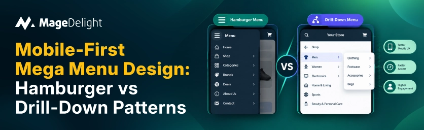
According to the Baymard Institute, 88 percent of US ecommerce sites use hover-activated mega menus on desktop. When the same menu is used on mobile without a redesign, it is often blamed for the highest rate of subcategory abandonment. Hover does not exist on a touchscreen. A desktop mega menu that is copied over unchanged simply fails. Two mobile patterns that actually work are the hamburger drawer and drill‑down navigation. They solve the problem in different ways.
This is not a cosmetic choice. Nielsen Norman Group research has repeatedly shown that the hamburger menu reduces discoverability compared to navigation. This is more important on an e-commerce catalog than on a small five-page brochure site.
This guide explains when each pattern earns its place, what real UX research says, and the tap target and structural details that most comparisons skip.
The Hamburger Drawer
The hamburger icon, three lines, opens a hidden panel that slides in from the side. It typically shows the navigation tree in a single scrollable or accordion list. The hamburger menu is the widely recognized mobile navigation pattern precisely because it is compact. It hides less frequent links behind one icon. This keeps the interface clean but hides almost everything from view until a shopper taps it open.
Works best when paired with a hybrid approach: show three to five critical items visibly in the header while tucking the rest behind the hamburger menu rather than hiding the entire navigation. The hamburger drawer should be structured as a level-by-level hierarchy, not a compressed, shrunk-down copy of the desktop mega menu’s multi-column layout.
Minimum 48px tap targets are the widely cited baseline for menu items inside the drawer, since there's no hover state on mobile to offer a second chance if a tap misses.
Drill-Down Navigation
Drill-down navigation shows one level of the hierarchy at a time, full screen. A tap on any item slides into a subpage rather than expanding a nested list in place. Figma’s mobile pattern is a clean real-world example. Tapping a top-level item slides into a subpage with its own layout, and an up arrow returns to the main menu. This closely mirrors how native iOS navigation behaves.
Fiverr runs a three-level drill-down on mobile. The hamburger menu opens to account actions and a "Browse categories" entry. Tapping that reveals a category strip. Tapping a category opens an outcome-grouped sublist. Each level carries its back arrow. The reasoning holds for any catalog this deep: drilling down respects the small screen by showing one focus at a time, and a marketplace with that many categories can't fit on one screen without becoming an unusable wall of nested lists.
• Each level needs its own clear back or up-arrow; losing that thread is the single fastest way to make drill-down feel disorienting instead of focused.
• Best suited to catalogs with depth of three or more meaningful hierarchy levels. When everything is crammed into one hamburger drawer, a wall-of-lists problem occurs. Drill-down avoids this problem.
Side-by-Side Comparison
|
|
Hamburger Drawer |
Drill-Down |
|
Best for |
Broad catalogs needing a compact entry point |
Deep hierarchies (3+ levels) needing focus per screen |
|
Discoverability |
Lower; hides all options behind one icon |
Higher within a level; one clear focus at a time |
|
Screen usage |
Slide-in panel, often a partial-width overlay |
Full-screen per level, like a native iOS view |
|
Navigation cue |
Close icon or tap-outside to dismiss |
Back arrow or up-arrow to return to prior level |
|
Risk if done poorly |
Wall of nested, scrollable lists |
Feels slow if depth exceeds 3 levels |
|
Real examples |
Most ecommerce sites, general pattern |
Fiverr (3-level), Figma (iOS-style sub-pages) |
Which Pattern Actually Fits Your Catalog
The honest answer is that catalog depth, not brand preference, should drive this decision. A store with five to seven top-level categories and shallow subcategories rarely needs the full drill-down treatment. A well-structured hamburger drawer with a level-by-level accordion covers it fine. A catalog with three or more genuine hierarchy levels- departments, subcategories, product types- tends to outgrow a single scrollable drawer and benefits from drill-down's one-focus-at-a-time structure.
• Count your actual hierarchy depth before choosing. If most categories are two levels deep or shallower, drill-down is likely overkill.
• A bottom navigation bar with four to five primary destinations is increasingly common alongside either pattern for mobile-first brands, mirroring native app behavior and reducing the cognitive gap between your mobile site and a shopper's other apps.
• Test the actual conversion metric, not menu interaction rate. The goal of better mobile navigation is more completed purchases, not more taps inside the menu itself.
Making the Top-Level Panel Feel Like More Than a List of Links
One detail most navigation comparisons skip: effective mega menus include visual imagery for faster recognition, and that principle doesn't disappear just because the screen got smaller. A hamburger drawer or a drill-down's top-level screen doesn't have to be pure text. Fashion and lifestyle brands commonly use that first panel, the one a shopper sees the instant they tap the menu icon, to surface a small strip of shoppable, visual content rather than another wall of category names.
A shoppable Instagram feed is a genuinely common way to do this well, since the format is already mobile-native: a scrollable grid of tappable images that a shopper instinctively understands from using the app itself. MageDelight's Instagram Feeds & Widget extension lets you tag products directly on Instagram images and surface that feed as a compact, responsive block, which fits naturally into a mobile drawer's top panel or a category landing screen without requiring a separate design system from the rest of your navigation.
This is not a replacement for navigation architecture. Crawlability, tap targets, and hierarchy decisions still matter more. It is a way to use the estate a shopper sees first for something more persuasive than a plain link list. This is especially true for driven catalogs where product discovery benefits from seeing the item in context rather than reading a category name.
Start From Catalog Depth, Not a Design Trend
Neither the hamburger menu drawer nor drill-down navigation is universally correct. The decision should follow your catalog’s hierarchy depth. Shallow broad catalogs are usually well served by a hamburger menu drawer with visible priority items. Deep multi level catalogs benefit from drill down’s one screen at a time focus. Whichever you choose, tap target sizing, back navigation cues and the visible item hybrid approach matter more to conversion than the pattern label itself.
If your drawer’s top panel is currently just a flat list of category names, adding a visual shoppable element like MageDelight’s Instagram Feeds & Widget is a low-effort way to make that first screen do more than route traffic. It can actually merchandise while it navigates.
Frequently Asked Questions
Is the hamburger menu bad for ecommerce conversion?
Not inherently. Nielsen Norman Group research shows that the hamburger menu reduces discoverability compared to navigation. The recommended fix is a hybrid approach: show three to five critical items visibly in the header and tuck secondary links behind the hamburger menu rather than hiding the entire navigation behind one tap.
How deep should drill-down navigation go before it becomes a problem?
Most UX guidance treats three levels as the ceiling. Beyond that drill down’s one focus at a time structure starts to feel slow. Each additional level adds another tap and another moment of waiting between the shopper and the product they are looking for.
Should I test hamburger vs. bottom navigation bar instead of drill-down?
It is worth testing as a variable. A bottom bar with four to five destinations is increasingly common for mobile-first brands and mirrors native app behavior. However, it competes for the limited screen space as the drawer or drill-down navigation, so the two are often combined rather than treated as mutually exclusive.
What's the minimum tap target size for mobile menu items?
48px is the figure most frequently cited for reliable tap accuracy across screen sizes, with some guidance citing 44px as an acceptable minimum. Below that range, mis-taps become common enough to measurably hurt the experience, especially in a drawer with multiple nested menu items stacked closely together.
